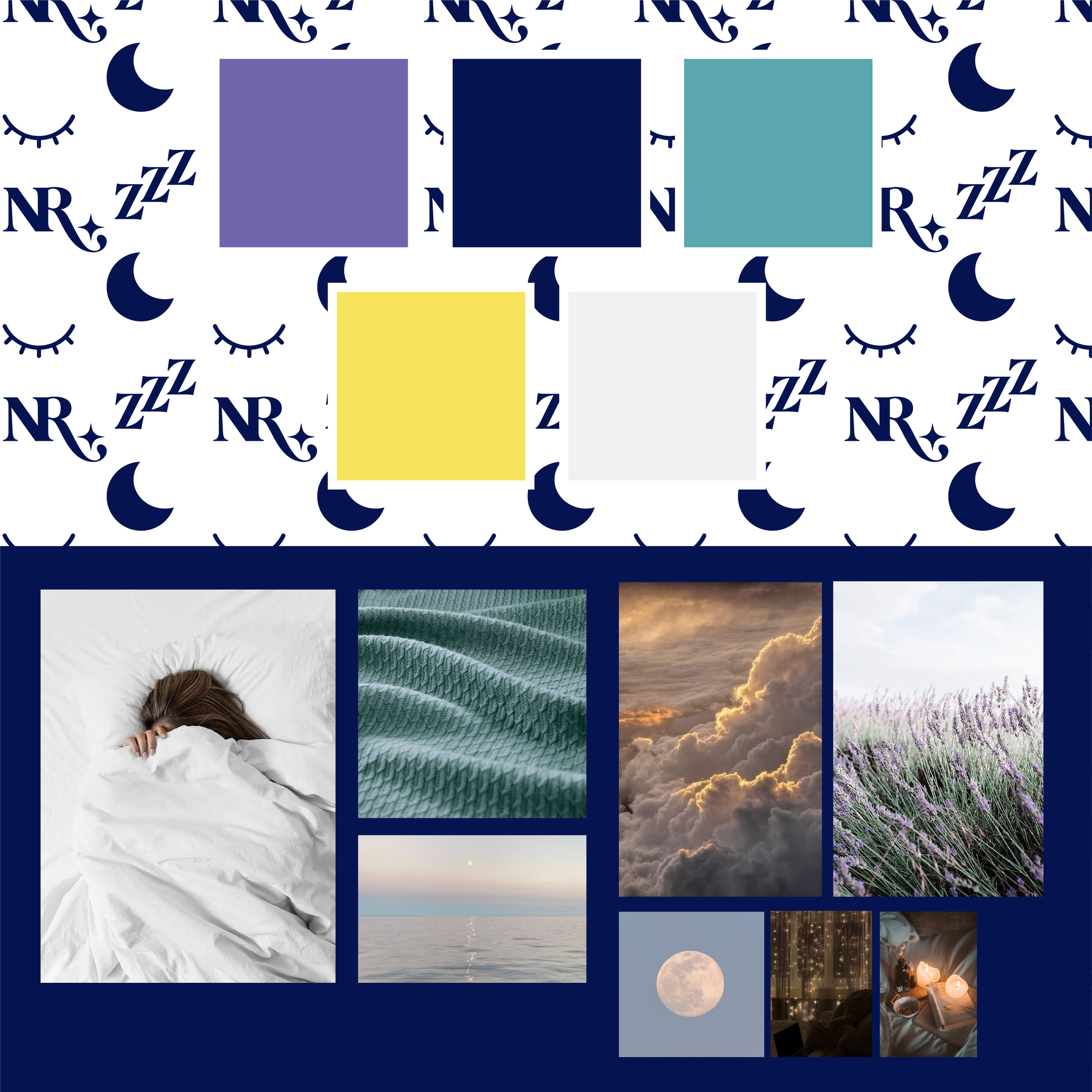
When I partnered with Natalie Ross, a certified sleep consultant, the mission was clear: create a brand that reflects the restorative power of sleep while helping her stand out in a growing wellness space.
We set out to craft a visual identity that was soothing, intentional, and empowering—designed to resonate with both exhausted parents and busy individuals who need a trusted guide toward better rest.
The challenge was to develop a brand that felt:
• Inviting and calming, without being dull or clinical
• Reflective of Natalie’s warm, trustworthy personality
• Anchored in clarity and purpose, with room to grow
Our collaboration began with a brand strategy session, where we defined Natalie’s mission, values, and voice. That foundation informed every design decision moving forward.
Highlights of the brand buildout include:
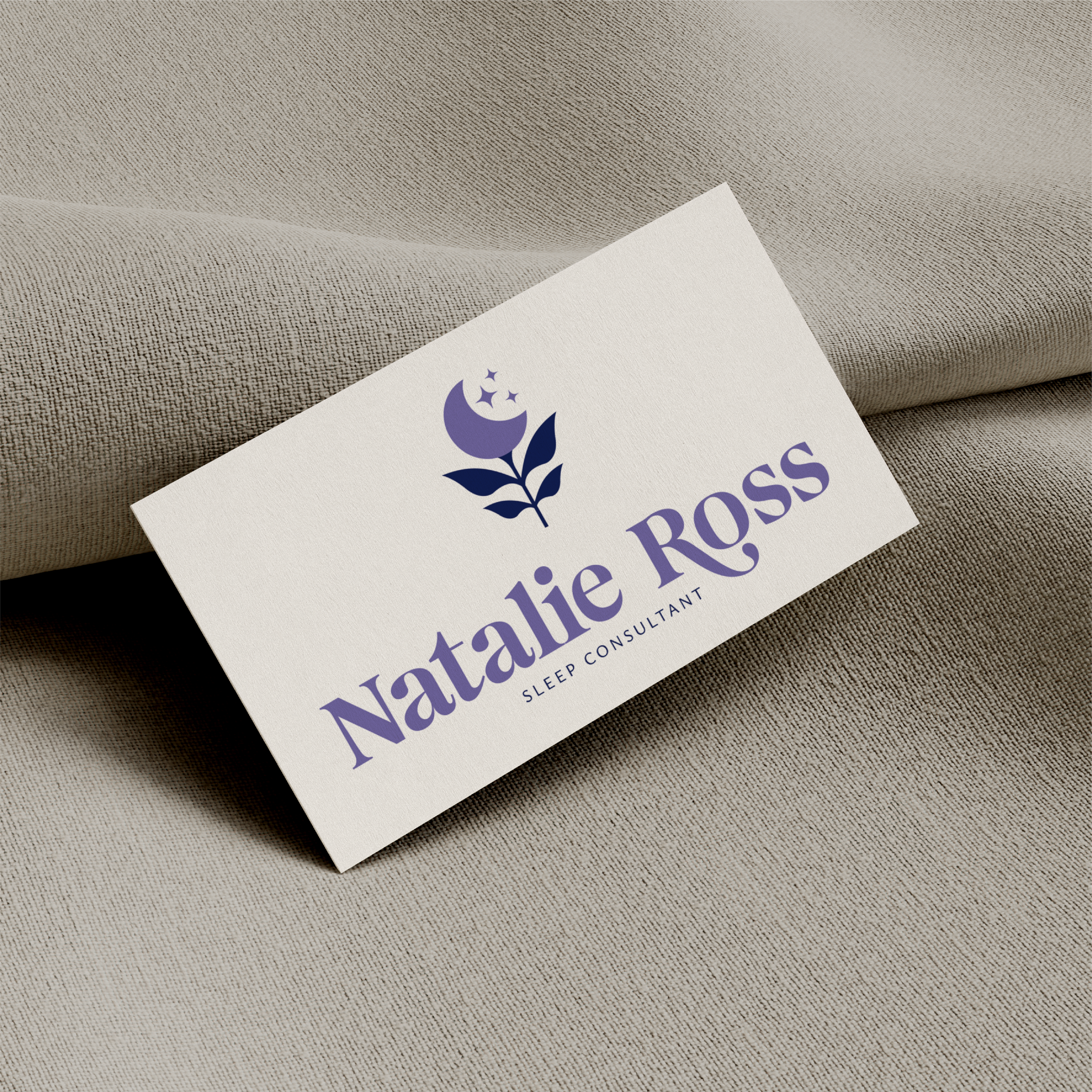
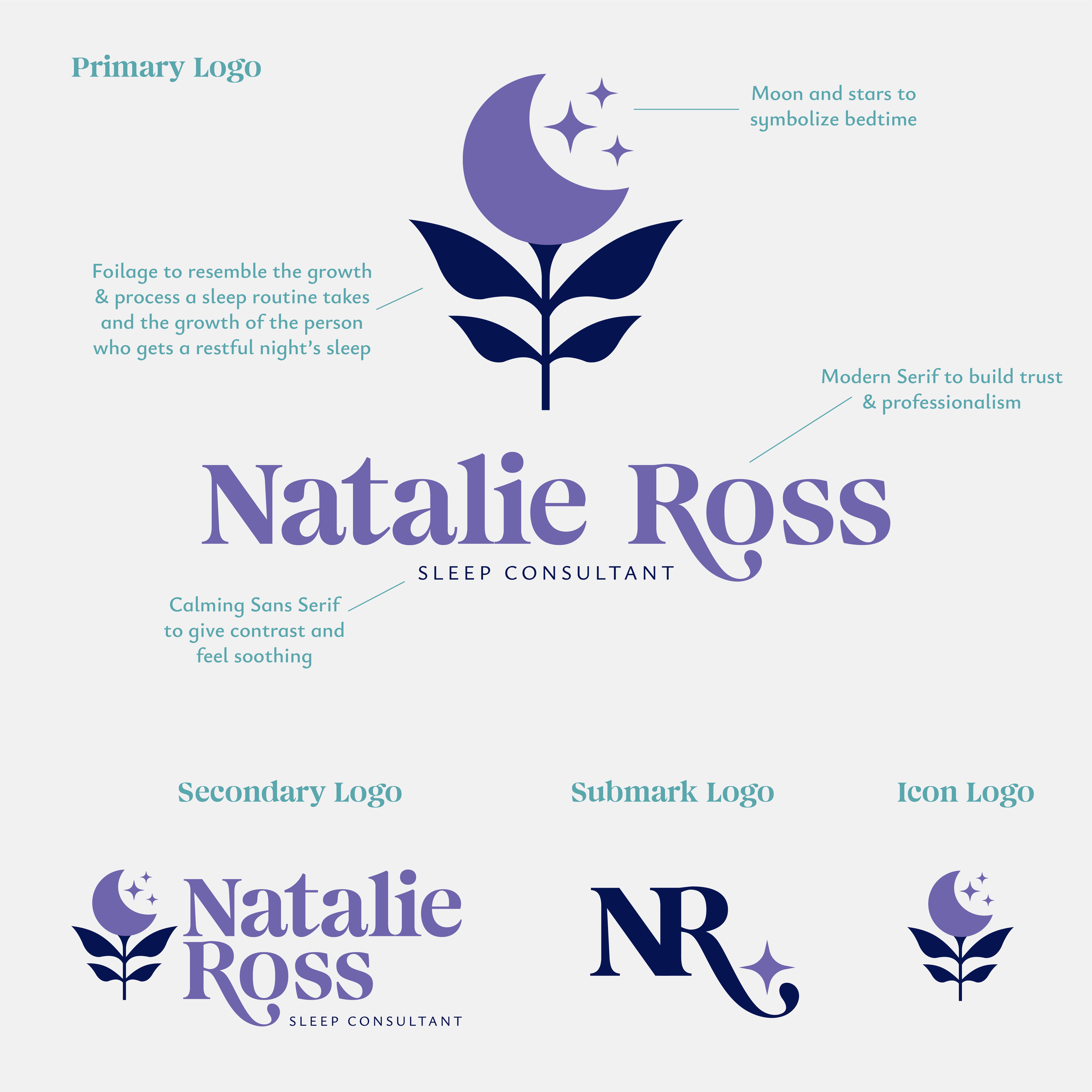
A custom brand mark designed to feel dreamy yet professional, with soft curves and celestial elements
A color palette that balances serenity with vibrancy, echoing the transformation that comes from deep rest
A brand voice and mission statement grounded in clarity, support, and empowerment—developed together during strategy
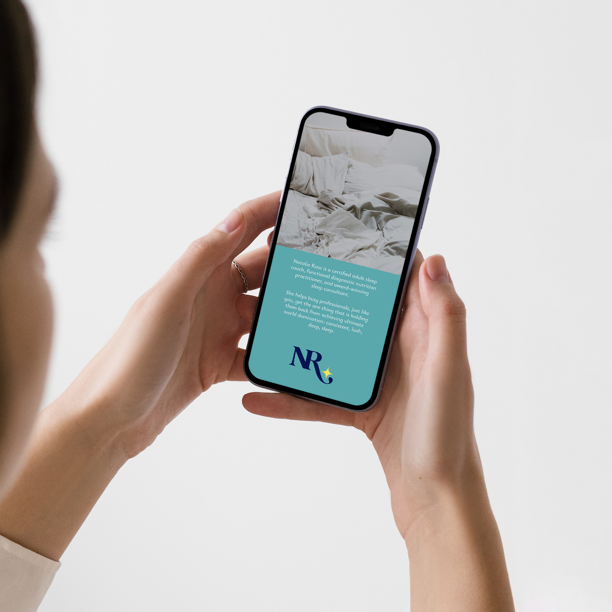
Visuals that translate seamlessly from digital to print, supporting Natalie’s long-term vision for growth
This identity gives Natalie the tools to show up consistently and confidently across her platforms. With a brand that reflects the calm she brings to her clients’ lives, she’s positioned to build trust, grow her presence, and transform the way people think about sleep.
“Being rested is the way to show up as your best self”—and this brand reflects that truth at every touchpoint.
