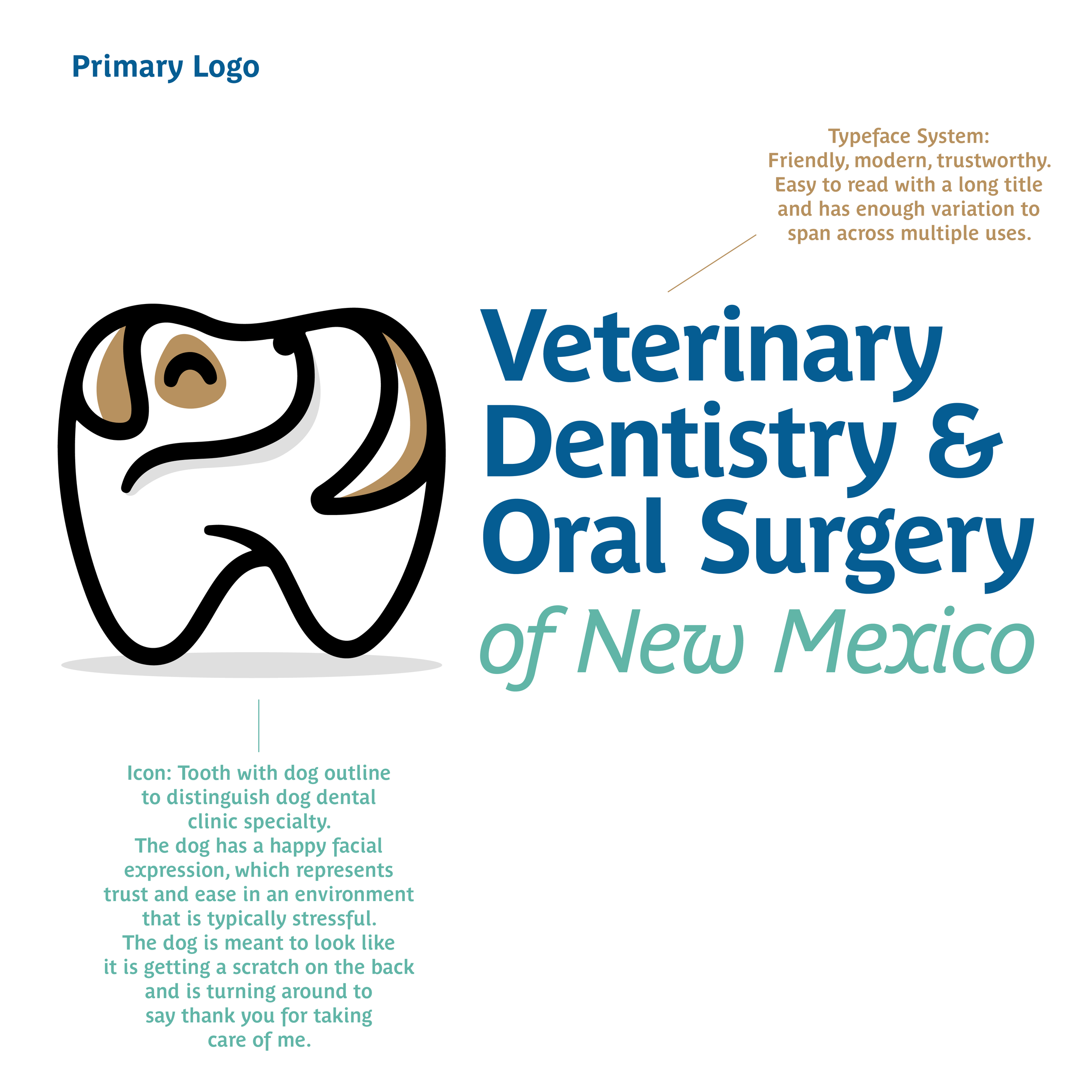
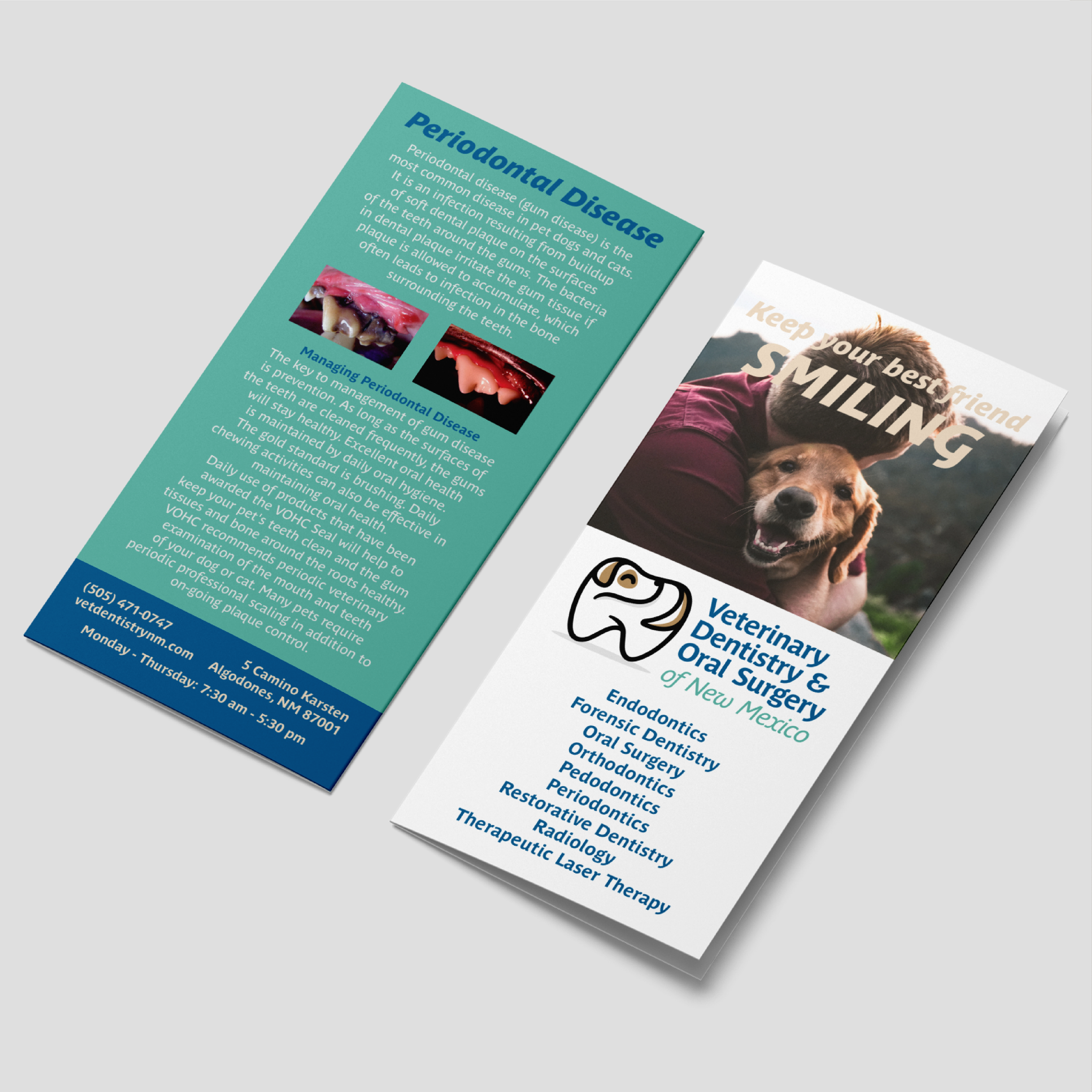
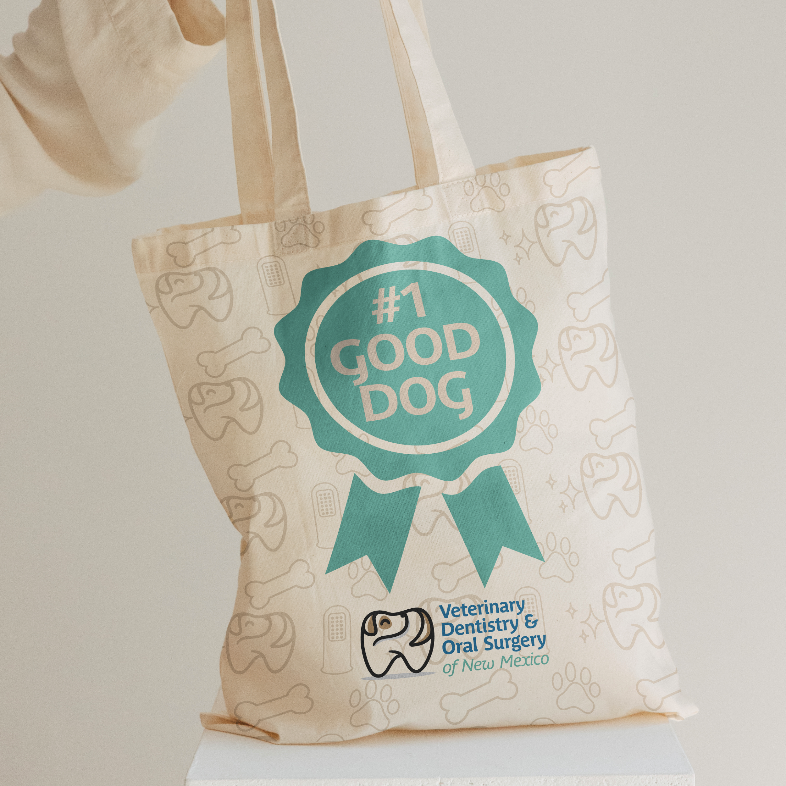
A dog’s dental health is an integral part of their overall health, and VDOSNM wanted to emphasize that with some form of tooth visual. The more I looked at a standard outline of a tooth, the more I wanted to use an actual dog in the main logo mark instead of something like a paw or a bone. For animals and humans alike, any sort of dental work can be a little intimidating, so by giving the illusion through a brand visual that everything will be fine was an idea I fell in love with.
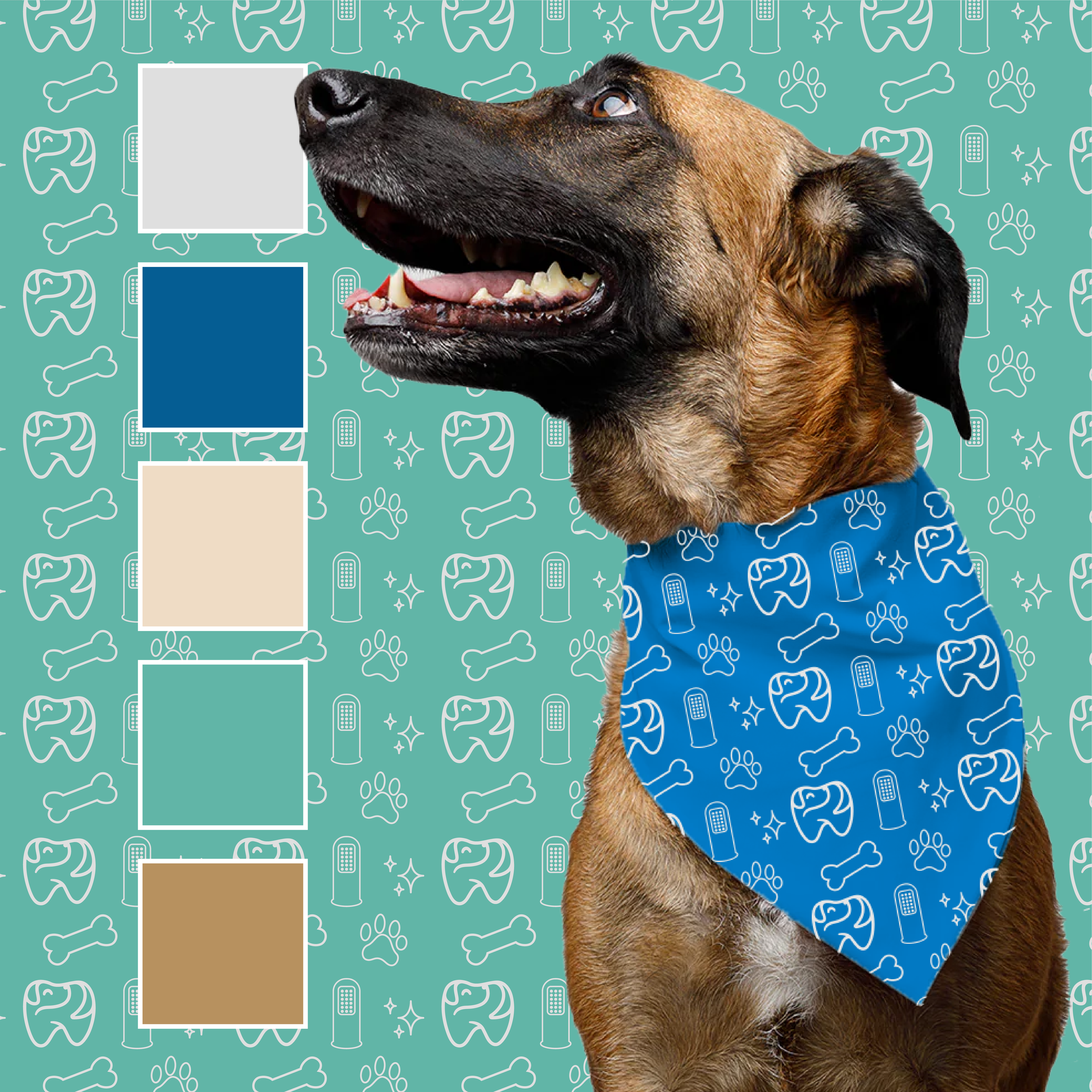
You know when you’re scratching or loving on a dog, they’ll turn back to you and almost thank you for making them feel so good? That’s exactly what I was trying to convey with this logo mark! It’s perfect to stand alone or pair with text, and versatile enough that it can be further simplified for the brand pattern. For the typeface system, I went with a playful, yet professional and modern sans serif that had some character and charm, but could also be used in body copy or sub headings.
Paired with a fresh color palette and brand pattern that could really bring the brand to life, I’m so happy to share this project! With a new brand, this clinic is sure to attract even more clientele and now their brand property represents their professional services and qualified team to best take care of your best friend!
